


How to Manage Color Tolerances for Consistent Results
Best Practices for Achieving Color Consistency
The effective management of color tolerances in printing is essential for accurate and consistent color and to guarantee printed colors match the intended ones. However, achieving color fidelity can be challenging due to various factors such as differences in equipment, substrates, and environmental conditions. This is where color tolerance management becomes indispensable. To effectively manage color tolerances and maintain quality standards, it’s crucial to have reliable methods for measuring color accuracy. In this article, we’ll explore the role of color tolerances in printing and how to measure them effectively to ensure reliable and consistent results.
The Science of Measuring Color
In the early 1900’s, Albert Munsell introduced colorimetry to the world – the science of measuring color. He did so by defining individual colors with an LCH system. L (Lightness - brightness) C (Chroma- saturation) and H (Hue-color).
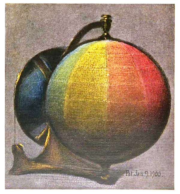
A color sphere; the color frontispiece from Albert Henry Munsell's 1905 pamphlet A Color Notation.
Colorspaces
Although LCH was revolutionary in its time, the need for a model that could communicate and duplicate color was needed. This arrived in the form of colorspace. A colorspace is a system where each color can be perceived and reproduced using a bidirectional and (typical) three-dimensional map. Colorspaces have evolved and improved over the years.
CIE RGB
The first colorspace was created in 1931 and was known as CIE RGB. This system first introduced the mappable coordinates of X,Y, and Z within the range of perceivable color by the human eye. XYZ defined the illuminance and chromacity of a color.
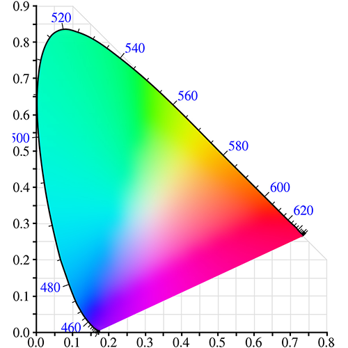
CIE RGB Colorspace
CIEL*A*B*
In 1976, CIEL*A*B* was introduced as a new and improved colorspace. In this case, the L* defined lightness, where A* is the red/green value and B* is the yellow/blue value. L*A*B* was designed to more accurately reflect how the human eye perceives color and differences in color. It is important to note that this is a ‘device independent colorspace’ unlike RGB spaces such as AdobeRGB or Gracol/Fogra CMYK colorspaces.
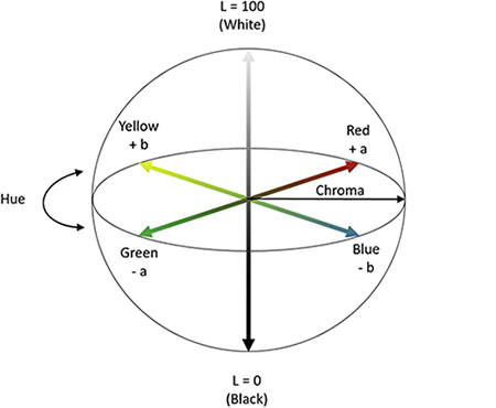
CIE L*A*B* Colorspace
Understanding Color Tolerances
Color tolerance refers to the acceptable deviation from a target color that is still considered visually acceptable. It establishes the range within which colors can vary, while still meeting the desired quality standards. It's typically expressed in terms of Delta E (ΔE), which quantifies the difference between two colors. The lower the ΔE value, the closer the match between colors.
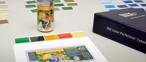
Before we can specify and follow a tolerance, we first need a target. A target is a fixed set of coordinates in a three-dimensional color space that is deemed the “correct” color. A target is typically L*A*B* based, and represents the desired lightness, hue, and chroma of a desired color.
It can’t be overstated how vital it is to know what the target color is, or “the standard”. Costly mistakes can be made on press when the target color is not well-defined and well-communicated. What is the print buyer’s expectation for the printed piece? Is it based on the Pantone book? Pantone digital standard or visual match? An ink drawdown? A soft proof or a hard one? Matching a previously printed piece or a digitally produced one? Everyone in the print process, from sales, to planner, to prepress, to press operator, must share the same clearly communicated understanding of what defines the “target color” in the buyer’s mind. Let’s delve deeper into the reasons.
Why Managing Color Tolerances is so Important
Brand Consistency
For businesses, maintaining brand consistency across all printed materials is crucial for building brand recognition and trust. Whether it's a logo, brand colors, or marketing collateral, any deviation in color can undermine brand integrity and confuse customers. By managing color tolerances, printers can ensure that every printed piece accurately reflects the brand's colors, reinforcing brand identity and credibility.
Customer Expectations
In today's competitive market, customers expect high-quality print materials that accurately represent their designs. Failure to meet these expectations can result in dissatisfaction and damage to the printer's reputation. By managing color tolerances effectively, printers can meet or exceed customer expectations, leading to increased customer satisfaction and loyalty.
Consistency Across Print Runs
In large-scale printing projects or reprints, maintaining consistency across different print runs is essential. Without proper color management, color variations can occur from one print run to another, leading to discrepancies in the final output. By defining and adhering to specific color tolerances, printers can ensure consistent color reproduction across multiple print runs, regardless of when or where they occur.
Cost Savings
Poor color management can lead to wasted materials, time, and resources. For example, if a print job requires multiple proofs and adjustments due to color discrepancies, it can result in increased production costs and delays. By managing color tolerances upfront, printers can minimize the need for reprints and adjustments, reducing waste and maximizing efficiency.
Regulatory Compliance
In certain industries, such as packaging for food and pharmaceutical products, compliance with color standards and regulations is mandatory. Failure to meet these standards can result in legal consequences and product recalls. By managing color tolerances within the specified regulations, printers can ensure compliance and avoid potential liabilities.
How to Measure Color Tolerances using a spectrophotometer
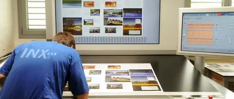
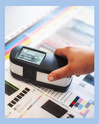
Spectrophotometers are essential tools for measuring color accurately in printing. These devices analyze the spectral reflectance or transmittance of an object across various wavelengths of light, providing precise color measurements.
Using a spectrophotometer, compare the L*a*b* color coordinates of the measured color patches with the target values. The L*a*b* color space is a device-independent color model that describes colors in terms of lightness (L*), Red/Green (a*), yellow/blue (b*). ΔE values can be calculated using various formulas, such as CIE76, Lch, CIE DEcmc, or CIEDE2000. The accuracy of the different tolerance in relation to visual acceptance has become better with each change. Visual acceptance using DE76 was 75%, with DEcmc the accuracy was about 85%. Now with DE2000 the visual acceptance is 95%. Choose the formula that best suits your requirements and preferences.
Practical Tips for Managing Color Tolerances
Standardize your Workflow
Consistency is the cornerstone of successful color management. Start by standardizing your printing workflow, from design to final output. This may involve a color management audit. Ensure that everyone involved in the process follows the same protocols and uses calibrated equipment.

Calibration
Calibration is the foundation of color management in printing. It involves adjusting and standardizing color settings across all devices involved in the printing process, including monitors, printers, and proofing devices. By calibrating these devices to a common color standard, you establish a baseline for color reproduction that ensures consistency throughout the workflow. G7 Calibration (near neutral) is an extremely useful tool for any CMYK device. The most common CMYK color spaces in North America are based on G7 Calibrated conditions.
Create and Maintain Color Profiles
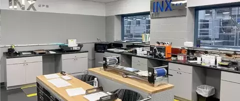
Invest in color management software that allows you to create and maintain color profiles for different devices and substrates. Calibration tools such as spectrophotometers and colorimeters can help you create custom profiles tailored to your specific printing environment. Regularly update and recalibrate these profiles to ensure consistent color reproduction over time. These tools help you accurately map colors between input and output devices, ensuring that the colors you see on your monitor closely match the final printed output.
Choose the Right Color Space
When working with digital images and graphics, it's essential to choose the appropriate color space for your intended output. Different RGB and CMYK color spaces, have varying color gamuts and which can affect color reproduction. For print projects, use a CMYK color space that is compatible with your printing process taking into account substrates, inks, and printing process to ensure accurate color representation. When choosing the optimal color space for your project, consider the output or finished product first, then work backwards. What type of surface the color will be on as well as lighting conditions and the desired gamut should play a part in your decision.
Establish Color Standards and Targets
Define specific color standards and targets for your print projects based on client requirements or industry standards. This includes specifying target colors using color swatches, Pantone® colors, or Delta E tolerances. By establishing clear color standards upfront, you provide a reference point for evaluating color accuracy throughout the printing process. Communicate these standards with your team and clients to ensure alignment and avoid misunderstandings.
Conduct Regular Color Checks
Implement a quality control process that includes regular color checks at various stages of the printing workflow. This may involve printing color patches or test charts and measuring them with a spectrophotometer to ensure they match the intended colors within acceptable tolerances. Once you've calculated ΔE values for each color patch, interpret the results to determine variation.
CONTACT
Solutions to reduce costs, speed products to market, and improve clients' brand image.
Contact a Color Management Rep
Communicate with Clients
Control environmental factors such as lighting, temperature, and humidity to optimize printing conditions. Ambient light can affect color perception, so ensure that your workspace is properly lit with neutral lighting. Maintain stable temperature and humidity levels to minimize fluctuations that could impact color reproduction.
Communicate with Clients
Effective communication with clients is key to managing color tolerances successfully. Discuss color expectations, preferences, and any specific brand colors or Pantone® references upfront to avoid misunderstandings later on. Keep clients informed throughout the printing process and involve them in color approvals to ensure their satisfaction with the final output.
Monitor and Maintain Consistency
Continuously monitor color consistency throughout the printing process, from proofing to final production; and follow best practices for color management. Keep detailed records of color settings, calibration data, and any adjustments made during the workflow. Regularly maintain and recalibrate equipment to ensure optimal performance and consistency over time.
Conclusion
Managing color tolerances in printing requires a combination of technical expertise, quality control measures, and effective communication. By following these practical tips, establishing clear color targets, calculating ΔE values, and implementing quality control measures, you can ensure reliable color reproduction in your print projects, satisfying clients and ensuring the highest quality output.
Share